Corona virus and data analytics
Dominik Seif - Apr. 01, 2020
The corona virus and data analytics
The world is currently threatened by the "corona virus" (SARS-CoV-2), which leads to the sickness called COVID-19. We all know the process of the virus roughly, which originated in Wuhan in China and spread very quickly all over the world. But how do we know exactly, how the virus is expanding, where it is very aggressive and how the process has been until now? Exactly, by detailed data analytics and data visualization. You certainly get informed about the daily news of the corona virus every day and often with well known visualizations on a map, as bar- or line chart and so on.
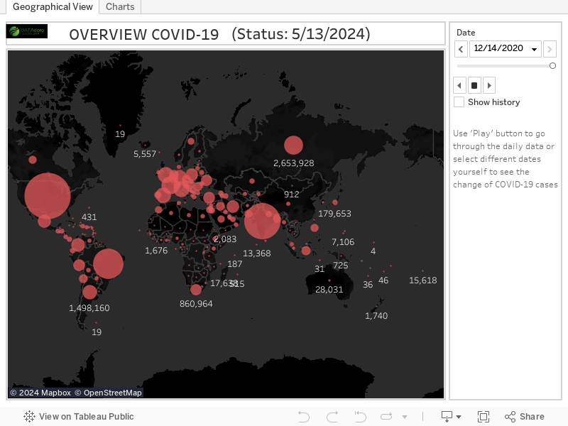
Thanks to today's state of the art we are able to make extremely detailed data analytics and to visualize that to the end user fast and easy. Nobody needs long explanations to understand what big red dots in different sizes on a map mean in terms of the "corona" virus.
At the moment it is very important for companies to keep track of their economic data. That way analyses, trends and forecasts can be build, with which the company can take actions from very quickly.
So we've built a dashboard with Tableau and we visualize current data of the "corona" virus. In the left tab "geographical view", you can see the process of the spread of the virus over time. You can use the "play" button to start an automatic sequence. In the second tab you get an overview with a bar chart and table chart and different level of details by single countries.
Attention: This view will be refreshed every day, so that you always have access to the latest data!