Tableau and Photoshop - The possibilities
Dominik Seif - Apr. 17, 2020
The possibilities with Tableau and Photoshop
All of you who have worked with Tableau already or have created various diagrams in Excel, you all certainly know, how many possibilites there are to visualize data in many different ways.
Hard to decide
In our today's example, we stick with Tableau to analyze and visualize data. Before you create a dashboard you always have the same question: How do I design it? How to structure it? What do I want to describe through it? And here we have endless possibilities of designing, structering and more. There are no boundries to "run riot" in terms of visualization. And that's what we want to do today.
Let's go wild
We want to go wild now and want to "run riot" in terms of visualization in Tableau. In general Tableau dashboards should be understandable, well-arranged and structured, must not need much of explanation und the user must understand very quickly, what the developer of the dashboard wanted to say with it. So we don't stick to general rules today and want to try something pretty. If you already worked with Tableau, then try to do something "new". That's a lot of fun and a nice variety to the "normal" dashboards.
Tableau and Photoshop - a strong team
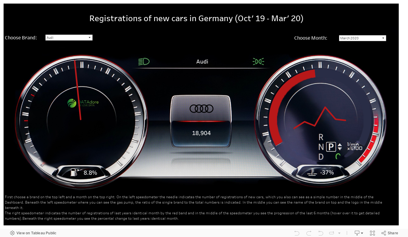
Before we started to create this dashboard, we thought about different types of data we could analyze and visualize. In this case we wanted to take a look at the german registrations of new cars within the last 6 months. This data is very interesting, because we can see which brands are preferred at the moment and how COVID-19 effects the number of registrations of new cars. There you can see very quickly, that the number of registrations of new cars decreased over the last months.
The next thoughts were about how to visualize this data. Of course we could create a few bar- and line charts, a few table charts, a little bit of reference line here, a little bit of distribution band there and so on. This would lead to an easy understandable and well-arranged Tableau dashboard. But, as said before, we wanted to "run riot" and so we decided to take a speedometer as a basis. The first step was to remove all areas within the speedometer (Numbers, needle and so on) with an image editing application (here we used Photoshop), to put our own values onto the speedometer. After we've "cleaned" the speedometer we used that image as a background in Tableau. After that we created different views (Gauge chart, line chart and so on) and put these onto the background. And that's how we got to the final Tableau dashboard shown below.
You see, there are much more possibilities to create various types of visualizations than just the well known charts. If you are interested in data analytics and visualizations, we gladly create various dashboards for you. Or book a professional Tableau Training. Feel free to contact us!