Worlddate with Tableau
Dominik Seif - May 29, 2020
Visualizing worlddate with Tableau
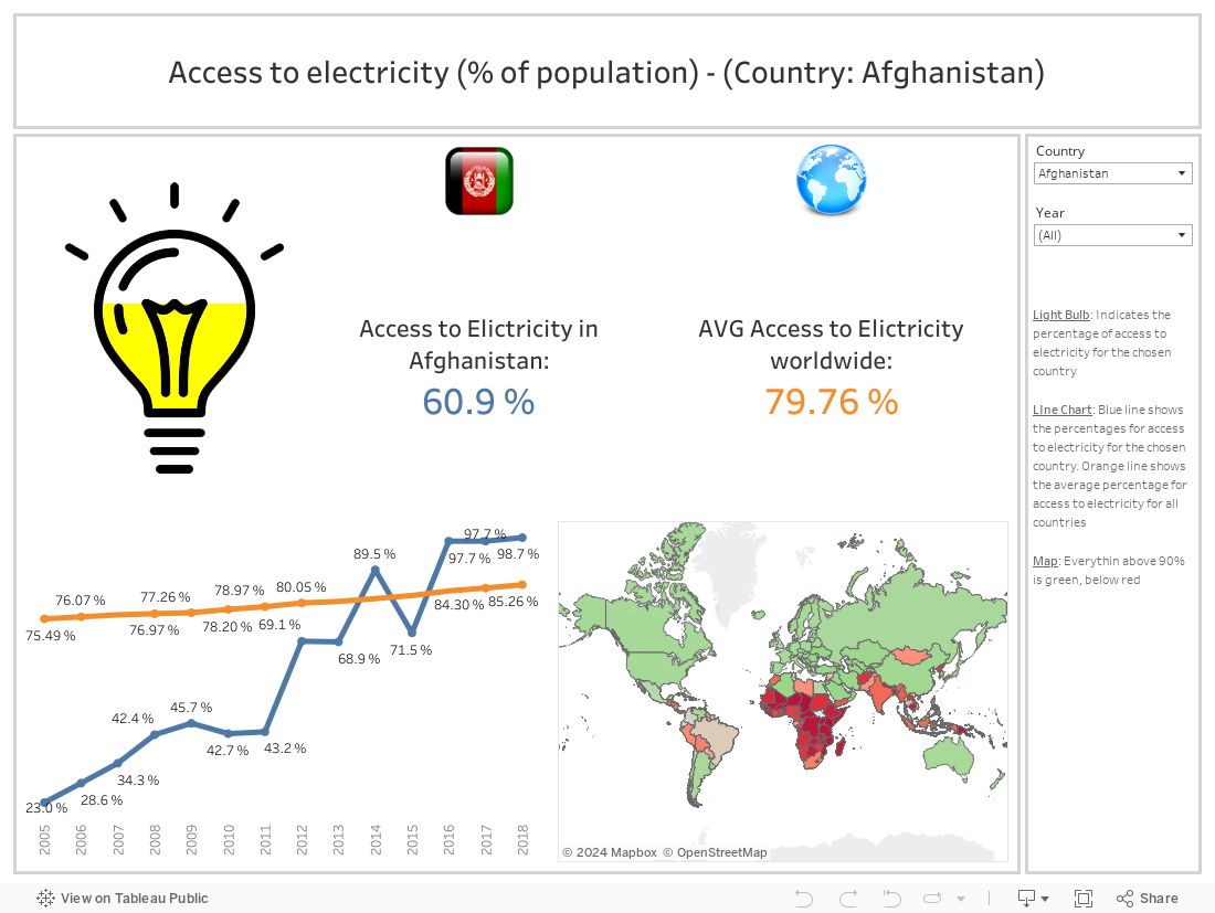
Today we start a series of various visualizations with Tableau. Here we use data of the worldbank and display them in different ways in Tableau. In the future we will show you many more Tableau visualizations regarding different subjects. Today we will display the worldwide access to electricity.
Worldwide access to electricity
In this data analysis we take a look at the worldwide access to electricity of the different countries and the percentage of the population which have access to electricity in these countries.
A few notes according to this visualization:
- On the right hand side you can choose from different countries and the appropriate years
- On the left hand side the filling of the light bulb indicates the percentage of the population which have access to electricity
- In the middle of the visualization you can see the country-specific percentage with the appropriate flag
- Right of that we have displayed the worldwide average
- Below these numbers you can see the moving annual percentage for the individual countries
- Last but not least we have a map which displays the worldwide distribution of access of electricity
We wish you a lot of fun with our series of Tableau visualizations. Stay tuned for more Tableau reports in the future!